COLLECTIVE HEALTH
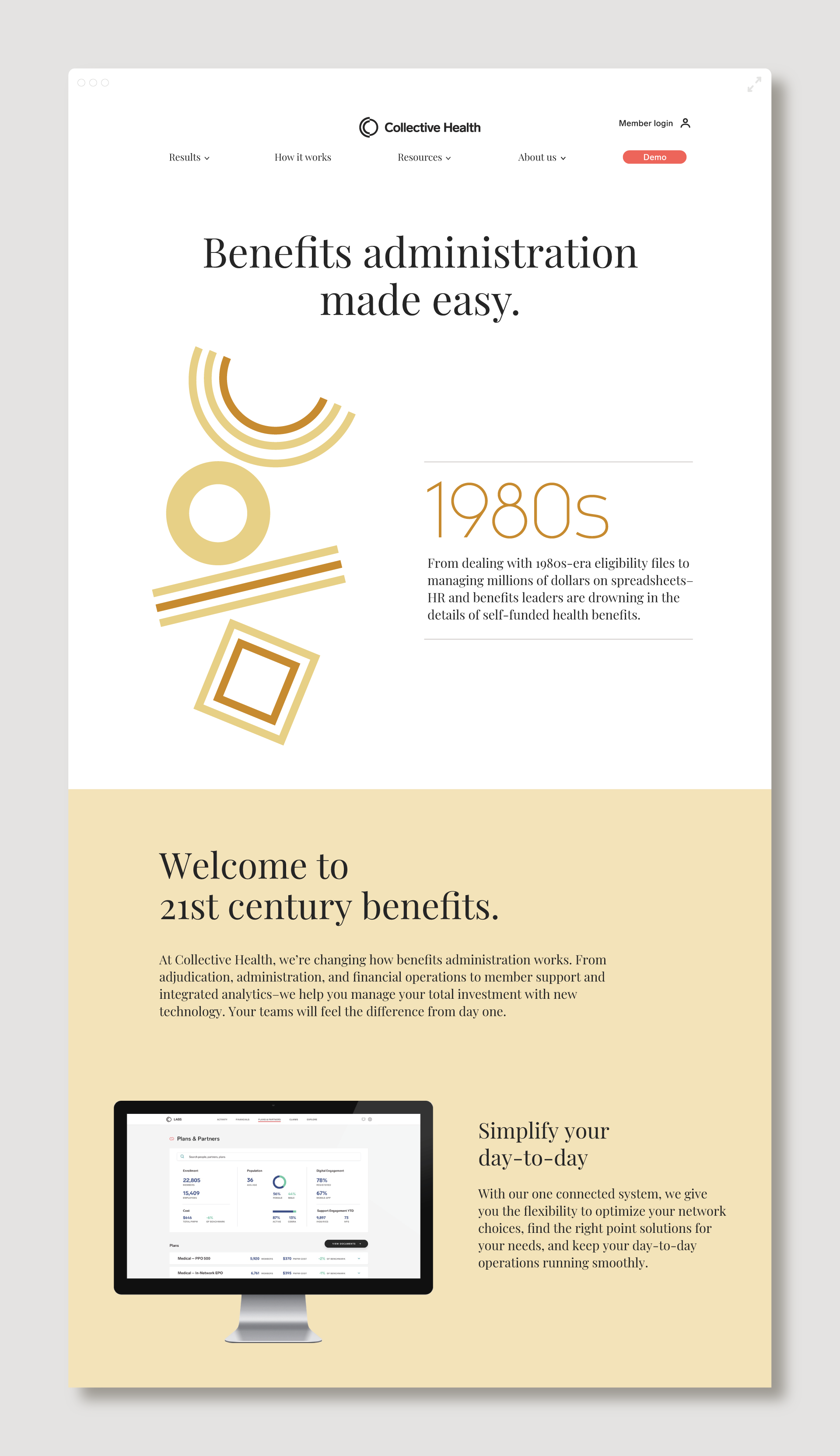
Pushup worked with Collective Health, the San Francisco-based heath-tech startup, on a brand update. Their initial bold and modern image had worked well to differentiate them in the healthcare marketplace, but on the cusp of their fifth anniversary, the company felt the brand was reaching its limit.
After diving in to clarify Collective Health’s core purpose and aligning it with future communication goals, Pushup worked with internal teams to evolve the branding for the next stage of growth. You can see examples of the brand system live on their website here.
Services // Brand Refresh, Web Layouts, UI x UX, Graphic System
Collective Health
Pushup worked with Collective Health, the San Francisco-based heath-tech startup, on a brand update. Their initial bold and modern image had worked well to differentiate them in the healthcare marketplace, but on the cusp of their fifth anniversary, the company felt the brand was reaching its limit.
After diving in to clarify Collective Health’s core purpose and aligning it with future communication goals, Pushup worked with internal teams to evolve the branding for the next stage of growth. You can see examples of the brand system live on their website here.
Services // Brand Refresh, Web Layouts, UI x UX, Graphic System

PUTTING THE USER FIRST
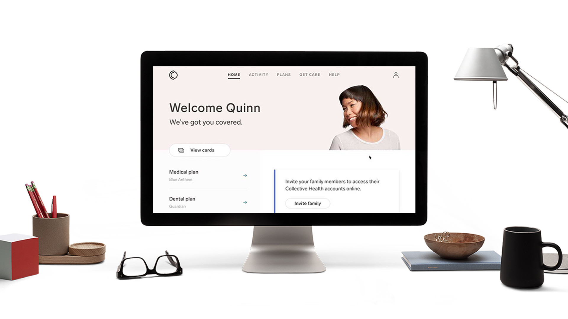
A goal of the company website was to capture the attention of potential customers — specifically HR benefits managers. We addressed this by expanding the brand system to include playful object photography — imagining what managers might have on their desk — and immediately placing them in the drivers seat of the CH product on the homepage.

PUTTING THE USER FIRST
A goal of the company website was to capture the attention of potential customers — specifically HR benefits managers. We addressed this by expanding the brand system to include playful object photography — imagining what managers might have on their desk — and immediately placing them in the drivers seat of the CH product on the homepage.

TYPOGRAPHY
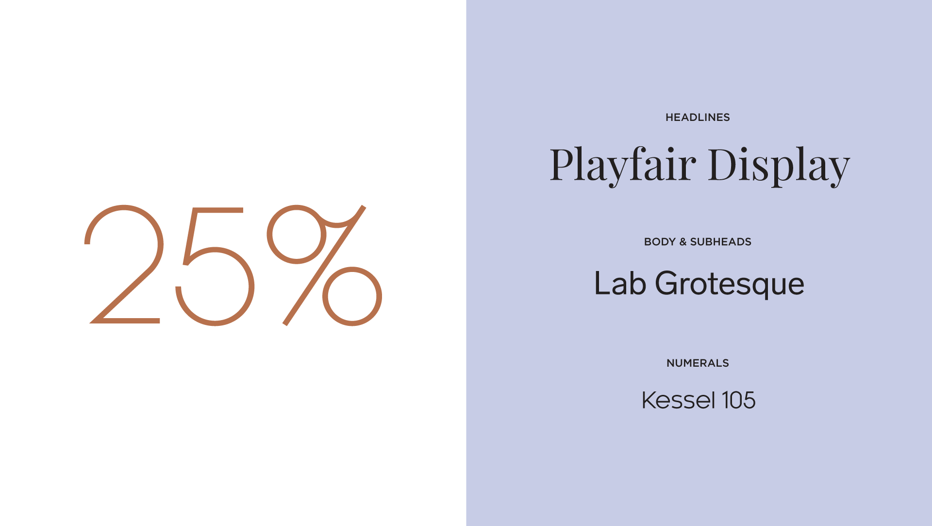
Throughout the year, Collective Health created a series of educational pieces for customers and the wider healthcare industry. To lend sophistication and credibility to white papers and the overall feel of the brand, the design team added a serif typeface. The brand’s original typography, Lab Grotesque, was retained for body copy and product applications. Additionally we introduced the geometric typeface, Kessel, for numerals to help enliven data infographics.
UX TESTING
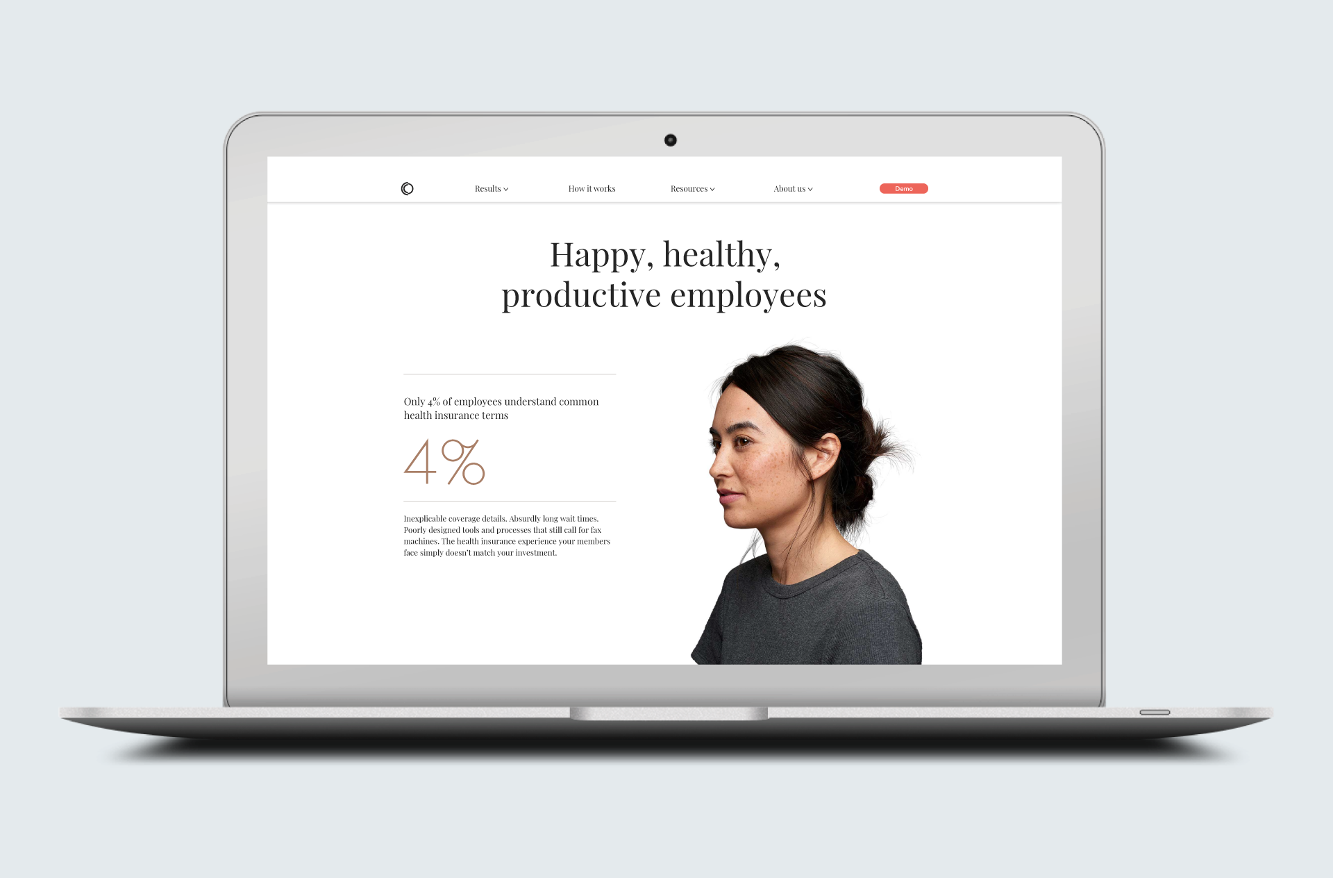
The Collective Health website had served well as a brand showcase, but internal teams wanted to update the site into a hard-hitting conversion tool. Pushup created digital prototypes, and worked with the Head of Growth and User Research to conduct qualitative testing. The outcome of the research study helped identify the UX interactions and messaging that resonated best with key test groups within the healthcare industry.
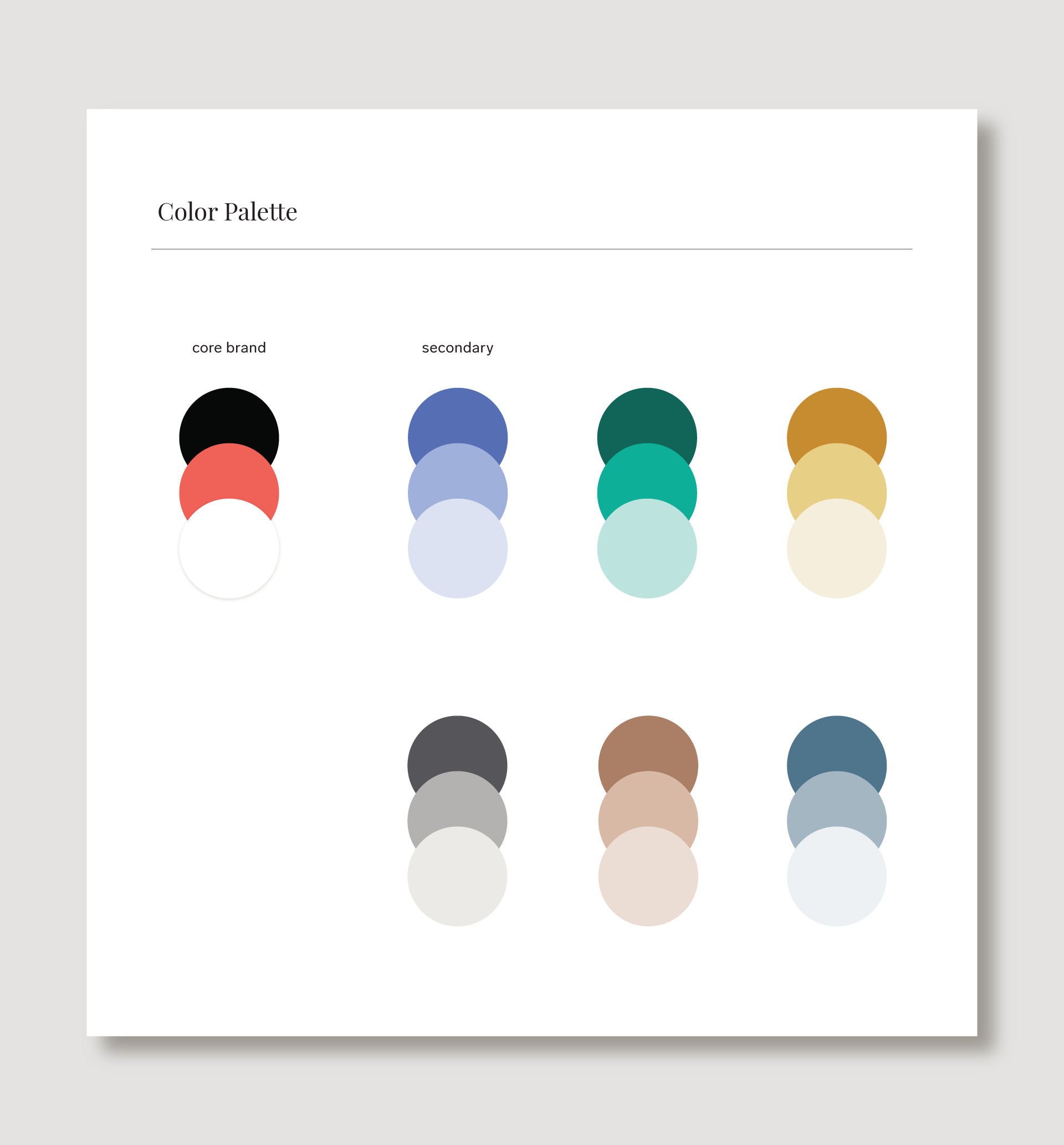
COLOR & GRAPHICS
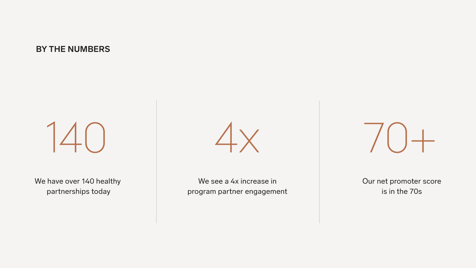
Collective Health had a bold yet limited color palette that the brand team was eager to expand. We extended the color range — allowing for broader communication possibilities — while avoiding the overused colors of the healthcare industry.
While working through the rebrand, we expanded the graphic system to help distill complex healthcare data and information. You can see more about the design process here.
COLOR & GRAPHICS
Collective Health had a bold yet limited color palette that the brand team was eager to expand. We extended the color range — allowing for broader communication possibilities — while avoiding the overused colors of the healthcare industry.
While working through the rebrand, we expanded the graphic system to help distill complex healthcare data and information. You can see more about the design process here.

Photography // Collective Health
Photography // Collective Health
Hello From San Francisco
© 2021 PushupCo
Hello From San Francisco
© 2021 PushupCo